Weekly marketing wisdom you can read in 5 minutes, for free. Add remarkable ideas and insights to your inbox, once a week, by subscribing to our newsletter.

Conversion Rate Optimisation
How to Reduce Bounce Rate On Your Website for Better Leads
Before you can fix a high bounce rate, you must stop thinking of it as a simple website statistic and start seeing it for what it really is: a business problem. A high bounce rate is a direct signal of wasted marketing budget and lost sales opportunities. It is a red flag showing a clear disconnect between the people you are attracting and what your website actually delivers.
Reducing that number is not just a technical tweak. It is a strategic effort focused on three core areas: improving page speed, aligning your content with visitor intent, and mastering the mobile experience.
Table of contents:
Why Your Bounce Rate Is a Critical Business Metric
It is easy to dismiss bounce rate as just another number buried in your analytics report, but that is a costly mistake. For any business that relies on its website for leads, the bounce rate is one of the most honest indicators of performance. When a potential customer clicks your ad, lands on your site, and leaves instantly, that is not just a lost session; it is marketing spend down the drain and a missed chance to make a sale.
Think of it as a diagnostic tool for your entire customer acquisition funnel. It tells you that something is fundamentally broken between the promise you made in your ad or search snippet and the experience you delivered on the landing page.
From a commercial perspective, a high bounce rate points to several serious issues:
- Wasted Marketing Spend: Every click from a Google Ads or Meta campaign that bounces is money spent with zero return. If your cost per click is £5 and 50% of visitors leave immediately, you are effectively paying £10 for every person who actually engages.
- A Leaky Sales Funnel: If people are leaving right at the start, they will never see your valuable mid-funnel content or get anywhere near your contact forms. Your sales pipeline is being starved before it has a chance to fill.
- Poor Lead Quality: A high bounce rate can also mean your targeting is off. You might be attracting visitors who were never the right fit for your services in the first place, leading to low-quality enquiries.
- Damaged Brand Perception: A frustrating, slow, or irrelevant first impression can be enough to put a potential customer off for good. You lose their trust before you have a chance to earn it.
To help you see where you stand, here is a quick look at typical bounce rates for different types of UK websites.
Bounce Rate Benchmarks for UK Websites
| Website Type | Typical Bounce Rate Range (%) |
|---|---|
| B2B Lead Generation | 30% – 55% |
| E-commerce & Retail | 20% – 45% |
| Content & Blogs | 35% – 60% |
| Landing Pages | 60% – 90% |
| SaaS Websites | 25% – 50% |
Remember, these are just benchmarks. A “good” bounce rate depends entirely on your industry, traffic sources, and the specific goal of the page. A high bounce rate on a blog post might be acceptable, but on a key service page, it is a major commercial problem.
The Real Cost of a Single Bounce
Let us imagine a common scenario for a B2B service company. Their marketing manager sees the website has a 45% bounce rate, which seems acceptable as it falls within the typical 30-55% range. But that average figure is hiding a deeper issue. On mobile, bounce rates often jump by 10-20% compared to desktop.
We also know that just a one-second delay in page load time can cause 11% fewer page views. This problem gets magnified on mobile, where conversion rates are often half of what they are on desktop. A fast, relevant experience is not just nice to have; it is non-negotiable. If you want to dive deeper, you can find more about UK website performance benchmarks at sozodesign.co.uk.
By reframing bounce rate from a vanity metric to a core performance indicator, you shift your focus from merely attracting traffic to retaining and converting it. This is the foundation of a scalable and profitable lead generation system.
Ultimately, learning how to reduce the bounce rate on your website is not about pleasing search engines. It is a strategic imperative for improving your return on investment and building a predictable growth engine for your business.
Diagnosing the Real Causes of a High Bounce Rate
Before you start tweaking page layouts or rewriting copy, you need to conduct a proper diagnosis. A high bounce rate is just a symptom, and your site-wide average is a dangerously misleading number. It lumps everything together, hiding the specific problems that are actually costing you leads.
Guessing a fix is like throwing money away. The real issue could be a Google Ads campaign sending the wrong kind of traffic, a key service page that is unusable on a phone, or navigation that makes no sense. The only way to know for sure is to dig into the data.
This is where a tool like Google Analytics 4 (GA4) becomes invaluable. By segmenting your data, you can stop chasing a vague, site-wide problem and start targeting the specific, solvable issues that are hurting your business.
Segmenting Your Traffic to Pinpoint Weak Links
Forget the overall bounce rate. The real insights come from breaking it down to see what is actually happening. You need to look for patterns in the data that point to the biggest leaks. This approach ensures you focus your time and budget where they will make a genuine difference.
Start by digging into these three core segments:
- Traffic Source: Are visitors from your paid ads bouncing more than those from organic search? If your Google Ads traffic has a sky-high bounce rate, it is a classic sign that your ad copy is promising one thing and your landing page is delivering another. That is your marketing budget going straight down the drain.
- Device Type: Compare your desktop, mobile, and tablet performance. A much higher bounce rate on mobile is a massive red flag. It almost always points to a poor user experience on smaller screens, such as slow load times, clunky navigation, or forms that are a nightmare to complete.
- Specific Landing Pages: Do not stop at the sitewide level; identify the exact pages that are letting you down. Is it a crucial service page? A popular blog post? Your homepage? These pages are the weakest links in your sales funnel and should be your top priority.
As this chart shows, a visitor who bounces is more than just a lost session; it is a lost opportunity and wasted ad spend.
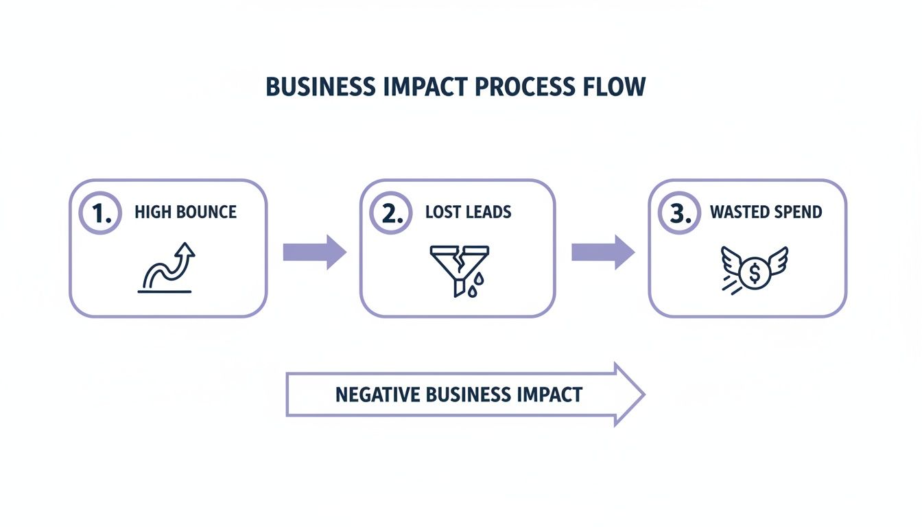
When someone leaves your site without engaging, it directly hits your lead numbers and your return on investment.
Interpreting the Data for Actionable Insights
Once you have segmented your traffic, the numbers will start telling a story. Your job is to translate that story into action.
For instance, you might discover that a key service page has an 85% bounce rate, but only for mobile users coming from a specific Meta Ads campaign. Suddenly, you do not have a “website problem.” You have a very precise user journey that is broken, and you know exactly where to start fixing it.
By isolating high-bounce segments, you move from broad assumptions to targeted hypotheses. This focus is critical for allocating your development and marketing resources efficiently and for seeing a measurable improvement in lead generation.
To turn your diagnosis into a plan, first use GA4 to find your top 3-5 problem areas: the specific combinations of landing page, traffic source, and device that are performing worst.
Next, for each one, ask why. Why are people leaving? Is the page loading too slowly? Is the main benefit not immediately obvious? Does the content completely mismatch the ad they just clicked? This is your working theory.
Finally, experience it for yourself. Grab your phone, click on the ad, and go through the exact journey your visitors are taking. You will often spot glaring issues that numbers alone cannot show you. This diagnostic work is the foundation of any successful plan to reduce your website’s bounce rate, ensuring you fix the real problems and start turning more visitors into customers.
Optimising Website Speed and Technical Health
Nothing kills a potential lead faster than a slow website. That split second it takes for your page to load is often all a visitor needs to decide they have had enough and hit the ‘back’ button.
Technical performance is not just a background issue for your IT team; it is a front-line commercial problem. It directly impacts your bounce rate and, by extension, your bottom line.
Every second of delay is a tangible loss. Research shows that 53% of mobile users will abandon a site that takes longer than three seconds to load.
Even a one-second delay can spike bounce rates by 32% and slash conversions by 7%. That is a massive loss for any business. This is not about chasing perfect scores for the sake of it; it is about removing the friction that costs you customers.
A faster, healthier website keeps users engaged, improves how they see your brand, and gives you a much better shot at turning them into a lead.
Getting a Diagnosis with PageSpeed Insights
Before you can start fixing things, you need a clear diagnosis of what is actually wrong. For this, Google’s PageSpeed Insights is an essential tool. It is free, analyses your site’s performance, and gives you a prioritised to-do list of what needs fixing.
It cuts through complex technical jargon and focuses on what truly matters for user experience.
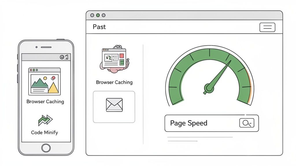
This report often highlights a performance gap between mobile and desktop, a common issue that sends mobile bounce rates through the roof.
The best part is that the recommendations are specific and actionable. Instead of vague advice, it will tell you exactly which images are too large or which code is slowing down the initial page render. This lets you focus your resources on the fixes that will deliver the biggest commercial impact.
Understanding Core Web Vitals
Within that PageSpeed report, Google flags three critical metrics known as Core Web Vitals. These are direct measures of user experience that influence both your bounce rate and your SEO rankings.
-
Largest Contentful Paint (LCP): How long does it take for the main content to appear? If it is slow, visitors are just staring at a blank screen, which is the number one cause of bounces. You need to aim for under 2.5 seconds.
-
Interaction to Next Paint (INP): This metric measures responsiveness. When someone clicks a button or opens a menu, how fast does the site react? Sluggish interaction feels broken and signals a poor-quality site.
-
Cumulative Layout Shift (CLS): Ever tried to click a button, only for the page to jump and you end up clicking an ad by mistake? That is CLS. It is infuriating for users and a major source of frustration.
Improving these three metrics is a direct investment in keeping people on your site. A website that feels fast, responsive, and stable is one that users will trust and explore further. If you want to dive deeper, check out our guide on how to improve Core Web Vitals.
Practical Steps to Boost Technical Performance
Once you have your diagnostic report, the path forward becomes much clearer. The goal is to make your website as lean and efficient as possible. While some fixes might need a developer, many are things you can tackle yourself.
Here are the most impactful actions you can take:
-
Compress Your Images: Large, unoptimised images are a common cause of slow load times. Use a tool to compress your image files without sacrificing noticeable quality. Switching to modern formats like WebP can also make a massive difference to file sizes.
-
Leverage Browser Caching: Caching tells a visitor’s browser to save parts of your website, like your logo and code. When they return, their browser can load these stored files instantly instead of downloading everything again. This makes all subsequent visits feel lightning-fast.
-
Minify Your Code (HTML, CSS, JavaScript): Minification strips out unnecessary characters from your website’s code, like extra spaces and developer comments. This makes the files smaller, so the browser can download and process them much more quickly.
By systematically working through these technical fundamentals, you build a more reliable asset for your business, one that ensures every visitor you pay to attract has a smooth experience from the very first second.
Improving User Experience and Content Clarity
A fast site gets visitors in the door, but it is the experience that makes them want to stay. Once you have sorted the technical performance, your focus must shift to the user experience (UX) and the clarity of your content. These are the two pillars that turn a fleeting visit into a genuine lead.
If someone lands on your page and cannot figure out what you do, why it matters, or what to do next within a few seconds, they are gone. This is why having a powerful, unambiguous value proposition ‘above the fold’ is non-negotiable. It must instantly answer the visitor’s silent question: “Am I in the right place?”
Get that initial clarity right, and you set the stage for everything that follows.
Align Content with User Intent
The number one reason for a high bounce rate is a disconnect between what a visitor expected and what they actually found. This happens all the time when ad copy promises one thing but the landing page delivers something else entirely. Your language, offer, and tone need to be a straight line from the ad they clicked to the content on the page.
For instance, if someone clicks an ad for “emergency plumbing repairs,” the landing page must speak directly to that urgency. It should not be your generic homepage, forcing them to hunt for the right service. When you meet their initial search intent head-on, you build immediate trust and give them a reason to stick around.
Structure for Scannability and Readability
People do not read a website like a novel; they scan. They look for headings, keywords, and phrases that jump out and solve their problem. A massive wall of text is one of the most effective ways to send visitors away.
You must design your content for how people actually consume it online.
- Use Clear Headings: Break up your text with descriptive H2 and H3 subheadings. They act as signposts, guiding users through the page so they can find what they need, fast.
- Keep Paragraphs Short: Stick to one to three sentences per paragraph. This creates valuable white space, making the page feel less intimidating and much easier to digest.
- Utilise Bullet Points: For lists of features, benefits, or steps, use bullet points. They are infinitely easier to scan than a long sentence.
This structured approach shows you respect your visitor’s time, which dramatically improves their on-page experience.
Prioritise a Mobile-First Design
With most web traffic now coming from mobile devices, a clunky mobile experience is commercial suicide. A responsive website that just shrinks to fit a smaller screen is no longer sufficient. You need a true mobile-first approach. You can learn more about this in our guide to improving user experience for mobile.
This means designing the entire user journey specifically for the small screen. You need to think about things like:
- Tap-Friendly Navigation: Are your buttons and links big enough for someone to tap easily with their thumb?
- Simplified Menus: Complex, multi-level desktop menus are a nightmare on a phone. Strip them back to the absolute essentials.
- Legible Fonts: Is your text large enough to be read comfortably without needing to zoom in?
A seamless mobile experience is not a “nice-to-have” feature; it is the absolute foundation of a modern lead generation website. Failing to get this right is one of the quickest ways to guarantee a high bounce rate.
For UK trades businesses, the connection between engagement and bounce rate is stark. Sites with a crippling bounce rate of around 85% often only get one or two page views per visitor. In contrast, well-optimised sites with a low 20% bounce rate can achieve seven to eight pages per visit. While 88.5% of users will leave a site because it is slow to load, your content and UX must be compelling enough to keep them there once it does.
Driving Action with Compelling CTAs
When a visitor lands on your page with no clear direction on what to do next, their default reaction is often to leave. A high bounce rate can be a direct symptom of failing to guide the user towards a valuable next step. This is where your call-to-action (CTA) becomes the most important signpost on the page, turning a passive browser into an active lead.
A great CTA gives the user’s visit a purpose. It instantly answers their subconscious question, “Okay, what now?” and bridges the gap between their initial interest and a meaningful action, like scheduling a demo or downloading a case study. Without that clear direction, all the traffic you worked so hard to get will simply vanish.
Crafting CTAs That Convert
The most effective CTAs are a mix of smart psychology, sharp design, and plain English. The goal is to create a button or link that feels like the most logical, beneficial next step for your visitor. Generic phrases like “Click Here” or “Submit” are conversion killers because they communicate zero value and make the user feel like they are doing work for you.
Instead, your CTA copy needs to be action-oriented and communicate the benefit. A good rule of thumb is to have it complete the sentence “I want to…” from the user’s point of view.
- Weak CTA: “Submit”
- Stronger CTA: “Get My Free Quote”
The stronger version focuses entirely on what the user gets, not the task they have to perform. This small shift in perspective can make a massive difference to your conversion rates and, as a result, reduce your bounce rate.
Your CTA is the final instruction you give a potential lead. If it is weak, vague, or hidden, you are practically asking them to leave. Make it impossible to miss and easy to understand.
Design and Placement for Maximum Impact
How your CTA looks and where you put it are just as important as the words themselves. A well-designed CTA should not need a map; it should pull the eye and make the next step completely obvious.
Here are a few design principles to follow:
- Use Contrasting Colours: Your CTA button needs to pop. Pick a colour that stands out against your page’s background but still fits with your brand. That visual contrast is a natural attention-grabber.
- Create White Space: Do not suffocate your CTA. Surrounding it with plenty of empty space prevents it from getting lost in the noise of other page elements, making it a clear focal point.
- Strategic Placement: The classic advice is to place your main CTA “above the fold” so it is visible without scrolling. For longer pages, it is also a great idea to repeat the CTA further down, catching users right when they have finished absorbing your content.
Matching the CTA to the User Journey
Not every visitor is ready to “Buy Now” or fill out a detailed form. Someone reading an introductory blog post has a completely different mindset to someone looking at your pricing page. Shoving the wrong CTA in front of them at the wrong time is a guaranteed recipe for a bounce.
This is why you need to think in terms of primary and secondary CTAs.
- Primary CTA: This is your main goal for the page (e.g., “Request a Consultation”). It is aimed at visitors who are showing strong buying signals and are further down the funnel.
- Secondary CTA: This is a lower-commitment alternative (e.g., “Download Our Free Checklist”). It is perfect for capturing the interest of people still in the research phase, keeping them on your site and in your ecosystem.
By providing options that cater to different stages of the buyer journey, you create more opportunities for engagement. This tiered approach helps you capture value from a much wider range of visitors, guiding them deeper into your site instead of letting them bounce.
Creating a System for Continuous Improvement
Reducing your bounce rate is not a one-time task. It is an ongoing process of testing and learning, guided by data and a genuine curiosity about how people use your site. The businesses that succeed treat it as a continuous cycle, where small, smart changes add up to create a significant commercial impact over time.
This mindset moves you away from making changes based on a gut feeling. Instead of a complete redesign based on what you think will work, you can methodically test what actually works for your audience. This is how you turn a website from a simple online brochure into a high-performance asset that keeps delivering a better return.
Using A/B Testing to Validate Changes
A/B testing (or split testing) is a straightforward way to pit two versions of a page against each other to see which one performs better. You simply show ‘Version A’ to 50% of your visitors and ‘Version B’ to the other 50%. The data will tell you, without a doubt, which one they prefer.
This process takes all the guesswork out of the equation. You can test just about anything on the page to see how it affects user engagement and your bounce rate.
Consider testing variables like:
- Headlines: Try a benefit-driven headline versus a direct, service-focused one. You might be surprised which one grabs attention.
- Calls to Action (CTAs): Does a button saying “Get Your Free Quote” work better than a more generic “Contact Us“? Test it.
- Page Layouts: Moving a contact form from the left to the right side of a page can have a surprising impact on lead volume.
- Images and Videos: Would a short explainer video hold attention longer than a static hero image? There is only one way to find out.
The key is to test one variable at a time. That way, you know for certain that the change you made was responsible for the lift (or drop) in performance. This creates a powerful feedback loop where every test teaches you something new.
Monitoring Behaviour with Qualitative Tools
Analytics tell you what is happening on your site, but qualitative tools help you discover why. Tools like heatmaps and session recorders give you a visual look into how real people are navigating your pages.
Heatmaps from tools like Hotjar or Clarity show you exactly where people are clicking, where their mouse hovers, and how far they scroll. You might find out they are clicking on something they think is a button (but is not), or that they are completely missing your main CTA.
Session recordings take it a step further. You can watch anonymised video recordings of real user sessions. Seeing someone get stuck in your navigation or rage-click a broken form provides insight that raw numbers simply cannot give you.
When you combine this “why” from qualitative tools with the “what” from your analytics, you get the full picture. You can then make strategic adjustments that fix real-world user frustrations, which naturally brings down your bounce rate and pushes up your conversions. These small wins are fundamental, and you can learn more in our deep-dive on how to improve conversion rates.
Your Bounce Rate Questions, Answered
There is a lot of confusing information out there about bounce rate. Let us clear up the most common questions.
What is a Good Bounce Rate?
The answer is: it depends entirely on the page. Chasing a generic industry average is a waste of time. While a typical range might be 40-55%, what really matters is the type of page you are looking at.
Consider the context:
- B2B Service Sites: A bounce rate between 30-50% here is often a good sign. It suggests people are arriving, getting interested, and clicking through to learn more.
- Blog Posts: Do not panic if you see bounce rates hitting 90% on a blog post. If someone Googles a question, your article answers it perfectly, and they leave happy, that is a success.
- Landing Pages: These are also a special case. Since they are built for one specific action, a high bounce rate is not necessarily a red flag if the page is converting well.
Key Takeaway: The only benchmark that truly matters is your own. The goal is not to hit an arbitrary number; it is to steadily improve the bounce rate on your most important pages, like your core service and contact pages, that drive business.
Bounce Rate vs. Exit Rate: What’s the Difference?
This is a classic point of confusion, but understanding the distinction is vital for figuring out what is actually happening on your site.
- A bounce is a single-page visit. Someone lands on a page and leaves without clicking anything else. The session ends there.
- An exit is simply the last page someone views in a session. They could have visited one page or ten pages before leaving.
Every bounce is an exit, but not every exit is a bounce.
A high exit rate on your “Thank You” page after a form submission is perfectly normal. They have completed the goal. But a high bounce rate on a key service page is a clear signal that something is pushing potential customers away.
Categories
Do You Need Assistance With
Sign Up To Our Newsletter