Weekly marketing wisdom you can read in 5 minutes, for free. Add remarkable ideas and insights to your inbox, once a week, by subscribing to our newsletter.

Web Development
Website Design for Lead Generation: A UK Business Guide
Let’s be blunt. For most businesses, their website is little more than a digital brochure. It’s a passive online placeholder that confirms the company exists, but does little else. A high-performance website, in contrast, is an active sales asset engineered from the ground up for one specific purpose: to generate a predictable stream of qualified leads.
That’s the difference between a static advert and a dynamic, 24/7 sales system.
Table of contents:
Your Website Is a Sales Tool, Not a Digital Brochure
It’s a scenario we’ve seen countless times. A UK business invests heavily in a website that looks impressive but completely fails commercially. They pour thousands into slick aesthetics, only for it to sit online gathering digital dust. The sales team is left to rely on the same, often less scalable, methods.
This is a significant missed opportunity, particularly if you are spending money on advertising only to send traffic to a platform that cannot convert.
The fundamental problem is a mismatch of purpose. A brochure is built to inform. A sales tool is built to persuade and capture. A website designed for lead generation moves the focus from “this is what we do” to “here is how we solve your specific problem, and here is what to do next.” Every element, from the headline down to the button text, is deliberately chosen to guide a visitor towards taking one specific, valuable action.
The Commercial Mindset Shift
When you start treating your website as a sales asset, you ask better questions. The conversation shifts from “does this look good?” to something more commercially robust:
- Does this page clearly articulate the value for our ideal customer?
- Is the journey from landing on the site to making an enquiry completely seamless?
- Are we making it exceptionally easy for qualified prospects to contact us?
- Can this platform handle and convert the traffic from our paid advertising campaigns?
Adopting this mindset changes everything. It reframes your website from a cost centre into a revenue-generating asset that actively fills your sales pipeline. To make this work, it’s crucial to weave proven B2B lead generation best practices into your digital strategy.
Your website’s success is not measured by traffic alone. It is measured by its ability to turn that traffic into tangible commercial opportunities. The only metric that truly matters is its contribution to your bottom line.
This guide provides the strategic blueprint to make that happen. If you need a refresher on why this digital asset is so fundamental, our article on why your company needs a website is a useful starting point. Now, let’s move past superficial design discussions and focus on building a high-performance system engineered to attract, engage, and convert your ideal customers.
Architecting Your Website for Conversion
It is tempting to jump straight into visual design, but that’s a classic mistake. A website that generates leads is not just about aesthetics; it is built on a solid commercial strategy. Before considering colours or fonts, you must map out a system that guides your ideal customer from the moment they land on your site to the moment they take action.
This begins by achieving clarity on two things: who are you trying to attract, and what specific path do you want them to follow? If you do not establish this first, you are guessing, and that is a quick way to burn through your marketing budget.
Defining Your Ideal Customer Profile
You cannot persuade someone if you do not know who they are. The first step is to define your Ideal Customer Profile (ICP). This is not a vague demographic sketch; it is a detailed picture of the exact type of business or individual who gains the most value from your services—and who, in turn, is most profitable for you.
Your ICP must cover:
- Firmographics: For B2B, this includes industry, company size, turnover, and location.
- Pain Points: What specific, expensive problems are they dealing with for which your service is the ideal solution?
- Triggers: What typically happens that makes them start searching for a solution like yours? A new regulation? Sudden growth?
- Decision-Making Process: Who is involved in approving the decision? What information do they need to see to feel confident in choosing you?
Defining your ICP is the bedrock of your entire website. It influences the tone of your copy, the case studies you feature, and the exact actions you ask visitors to take.
Mapping The Customer Journey
Once you know who you’re talking to, you need to map their journey. Prospects do not land on your homepage ready to buy. They move through different stages, from initial problem awareness to seriously considering their options. When planning your website, a key part of this is applying effective customer journey optimization techniques to guide them from the first click to the final conversion.
This flow must feel logical and effortless. You have to anticipate their questions at each stage and provide the right answers, gently guiding them towards the next logical step. For UK small businesses, this is non-negotiable; a significant 84% state their website is a ‘big part’ of their success. Why? Because an effective site maps this journey perfectly, making the path to becoming a lead incredibly simple.
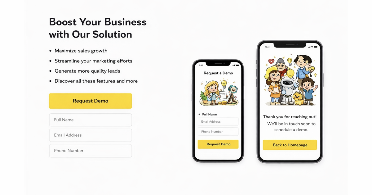
This diagram illustrates the crucial mindset shift required: from viewing your site as a passive online brochure to an active sales tool.
The key takeaway is that your website’s entire structure should be designed to actively capture and funnel leads, not just display information.
From Sitemap To Wireframe
With your ICP and user journey defined, it is time to turn that strategy into a concrete structure. This is where sitemaps and wireframes are essential. These are not just technical exercises; they are the architectural blueprints for your lead generation engine.
A sitemap is a list of all pages on your website, organised by hierarchy. It forces you to think logically about information architecture and ensures every page has a purpose. It should mirror the customer journey, with clear paths from informational content (like blog posts) to commercial pages (like services and contact pages).
Your sitemap is the skeleton of your conversion strategy. If the structure is weak or confusing, the entire system will fail, regardless of how good the design looks.
A wireframe, on the other hand, is a basic visual layout of a single page. It strips away all design elements like colours, images, and fonts. The focus is purely on structure, hierarchy, and placing key elements such as headlines, calls-to-action, forms, and testimonials in the most effective positions.
Wireframing answers the critical question, “What is this page supposed to do?” long before you ask, “What will this page look like?”. It is a process that guarantees every page is built with a commercial goal from the start.
Designing Pages That Persuade and Convert
You have your strategic blueprint. Now it is time to move from the high-level architecture to the page-level details. This is where conversions are won or lost—turning your sitemap and wireframes into persuasive experiences that compel visitors to take action.
This is not about adopting the latest design trend. It is about being deliberate with your user experience (UX) and user interface (UI) choices. The goal is simple: reduce friction, create clarity, and make engaging with your business feel like the obvious next step.
Establish Visual Hierarchy and Clarity
When a potential lead lands on your page, you have seconds to make an impression. A cluttered, confusing page signals a lack of professionalism and sends them to the back button. Good design uses visual hierarchy to guide their eyes to what matters most, in the right order.
You can achieve this with a few core principles:
- Size and Scale: Your main headline must be the most prominent element on the page. It is your single best chance to communicate value. Key call-to-action buttons should also be visually distinct.
- Whitespace: Do not be afraid of empty space. It is one of the most powerful tools in a designer’s toolkit. It allows content to breathe, reduces cognitive load for the user, and naturally draws attention towards your conversion points.
- Colour and Contrast: Use colour with purpose. A single, bright, contrasting colour for your main CTA buttons makes them impossible to miss. It is a visual cue that tells the user exactly where to click.
Get these elements right, and visitors will instantly understand what the page is about and what you want them to do next. This clarity is a cornerstone of creating websites that prioritise user experience and is fundamental to keeping people engaged.
Craft Calls-To-Action That Drive Action
Your Call-to-Action (CTA) is the most important element on any conversion-focused page. It is the final instruction that turns a passive visitor into an active lead. Generic, lazy CTAs like “Submit” or “Click Here” are where good leads are lost.
A high-performing CTA is specific, value-driven, and uses a strong action verb. It clearly states what the user gets by clicking.
A great CTA doesn’t just ask for a click; it promises a clear and valuable outcome. It completes the sentence, “I want to…” for the user. For instance, “I want to Get My Free Proposal” or “I want to Download The Guide.”
The language you choose is critical. Instead of a vague “Contact Us,” try “Request a Callback.” Instead of “Learn More,” consider something more specific like “View Pricing and Plans.” This small shift removes ambiguity and aligns the button with what the user is trying to achieve, which can have a significant impact on your click-through rates.
Design Frictionless Lead Capture Forms
The form is the final hurdle, and it is where many potential leads drop off. A long, complicated, or confusing form is a conversion killer. Every field you add increases friction and lowers the chance of completion.
Your job is to make this process as quick and painless as possible.
Only ask for what is absolutely essential for the first contact. Do you really need their phone number, company size, and job title immediately? Or can you proceed with a name, company, email, and a message box? You can always gather more details later in the sales process.
Consider these practical tips for better forms:
- Minimise Fields: Be ruthless. Only request information you need to qualify and contact the lead.
- Use Clear Labels: Do not put labels inside the input fields (placeholder text). Keep them visible above the field so users do not forget what they are supposed to be typing.
- Provide Reassurance: A simple message like “We respect your privacy and will not share your details” can do wonders for building trust at the point of conversion.
- Optimise for Mobile: Ensure your forms are easy to complete on a small screen. Think large input fields and buttons that are easy to tap with a thumb.
To help you get this right, here’s a breakdown of what to do—and what to avoid—when designing your CTAs and forms.
High-Impact CTA and Form Design Principles
| Element | Effective Practice (High Conversion) | Ineffective Practice (Low Conversion) |
|---|---|---|
| CTA Text | Action-oriented, value-driven (e.g., “Get My Free Audit”) | Generic, passive (e.g., “Submit,” “Click Here”) |
| CTA Colour | Contrasting, stands out from the page background | Blends in, uses a brand colour that does not stand out |
| Form Length | As short as possible (2-4 essential fields) | Too many fields (5+), asks for non-essential info |
| Field Labels | Always visible, placed above the input box | Placeholder text that disappears when typing |
| Trust Signal | Includes a short privacy statement or social proof | No reassurance, leaving user uncertain about their data |
| Error Handling | Clear, specific error messages shown in real-time | Vague “Error” message after submission attempt |
| Button State | Clear visual feedback on click/hover (e.g., colour change) | Static, no visual change on interaction |
Getting these details right is not just about aesthetics. The design of your forms and CTAs has a direct, measurable impact on your lead volume. A small increase in your form submission rate can significantly impact your sales pipeline without spending a single extra pound on marketing. By systematically removing friction, you make it easier for qualified prospects to say “yes.”
Fuelling Your Site With SEO And Content Strategy
A well-designed website is useless if your ideal customers cannot find it. The most intelligent calls-to-action and slickest forms mean nothing without a steady stream of the right kind of traffic. This is where your website design must work hand-in-hand with a robust SEO and content strategy from the very beginning.
Too often, SEO is treated as a last-minute fix—a checklist of technical tweaks applied to a site that is already built. This is a fundamentally flawed approach. A website that genuinely generates leads is built on a solid technical SEO foundation from day one, ensuring it’s fast, secure, and easily understood by search engines.
This is not about chasing vanity metrics or ranking for obscure keywords. It is about attracting visitors who have commercial intent and are actively searching for the solutions you offer.
Building On A Strong Technical SEO Foundation
Before you write a single blog post, your website’s core structure must be technically sound. Search engines like Google want to send their users to sites that provide a great experience, and technical performance is a huge part of that equation.
This foundation has a few key pillars:
- Site Speed: Every second a page takes to load dramatically increases the likelihood a potential lead will give up. A fast site is non-negotiable for keeping users engaged.
- Mobile Optimisation: Most web traffic now comes from mobile devices, so your site must look and function flawlessly on a smaller screen. There is no room for error here.
- Clean URL Structure: Simple, logical URLs (like
/services/lead-generation) help both users and search engines understand your site’s hierarchy. - Structured Data: This code helps search engines get a clearer picture of your page content. Implemented correctly, it can lead to more prominent search results.
These elements combine to position your site as a trusted, authoritative platform in the eyes of search engines, providing the perfect launchpad for your content. For a deeper dive, our guide on SEO for small businesses in the UK lays out a more detailed roadmap.
Driving Qualified Traffic With Strategic Content
With that solid technical base in place, it is time to create content that directly answers the questions your ideal customers are typing into Google. This is how you attract organic traffic that is already problem-aware and searching for a solution.
A strategically planned blog or resource hub is not just a content marketing exercise; it is a powerful lead generation asset. The goal is to develop topic clusters—a main “pillar” page covering a broad topic, supported by several “cluster” articles that explore specific sub-topics in more detail.
This model does more than signal your expertise to search engines. Crucially, it provides genuine value to potential customers, building trust and naturally guiding them through their buying journey on your website.
Your content strategy should map directly to your sales funnel. Create content for every stage, from top-of-funnel educational articles that attract new audiences to bottom-of-funnel case studies that help close the deal.
This approach ensures you capture interest from prospects regardless of their readiness to buy. This is especially relevant in the UK market, where professionals rank lead generation as the second most valuable metric, just behind high conversion rates. While over half of UK businesses have seen their traffic increase, only those with an integrated content and design strategy are turning that traffic into leads. You can explore more of these UK digital marketing statistics for 2025.
By weaving SEO and content into your website project from the start, you transform it from a static brochure into a dynamic engine for attracting, nurturing, and converting high-quality leads. It ensures the right people find you for the right reasons, improving the efficiency and ROI of your entire marketing effort.
Measuring Performance And Optimising For Growth
Launching your new website is not the finish line; it is the starting line. Think of it less as a finished product and more as a dynamic sales tool. A high-performance website is never a ‘set and forget’ asset. It needs constant measurement, analysis, and optimisation to deliver commercial value.
Without a solid system for tracking performance, you are effectively flying blind. You have no way of knowing what is working and what is wasting your budget. This is where the real work begins—turning raw data into actionable insights that fuel continuous improvement and drive predictable growth.
Establishing Your Core Performance Metrics
To optimise anything, you must first define what success looks like. For a lead generation website, success is measured by its direct contribution to your sales pipeline. Vanity metrics might feel good, but they do not pay the bills.
Your focus should be on a handful of commercially-grounded Key Performance Indicators (KPIs):
- Conversion Rate: The percentage of visitors who take a desired action, such as filling out a form. It is the primary measure of your site’s persuasive power.
- Cost Per Lead (CPL): Divide your total marketing spend by the number of leads generated. This tells you exactly how much it costs to acquire a new sales opportunity.
- Lead-to-Customer Rate: What percentage of leads convert into paying customers? This metric reveals the quality of your leads and the alignment between marketing and sales.
- Return on Ad Spend (ROAS): For every pound invested in advertising that drives traffic to your site, how much revenue is generated? This is the ultimate measure of profitability.
Tracking these KPIs properly requires a robust analytics setup, usually involving Google Analytics 4 (GA4) with correctly configured conversion goals. It is also vital to integrate this tracking with your ad platforms and, ideally, your Customer Relationship Management (CRM) system. This creates a closed-loop reporting system, allowing you to trace a paying customer back to the specific ad or keyword that first brought them to you.
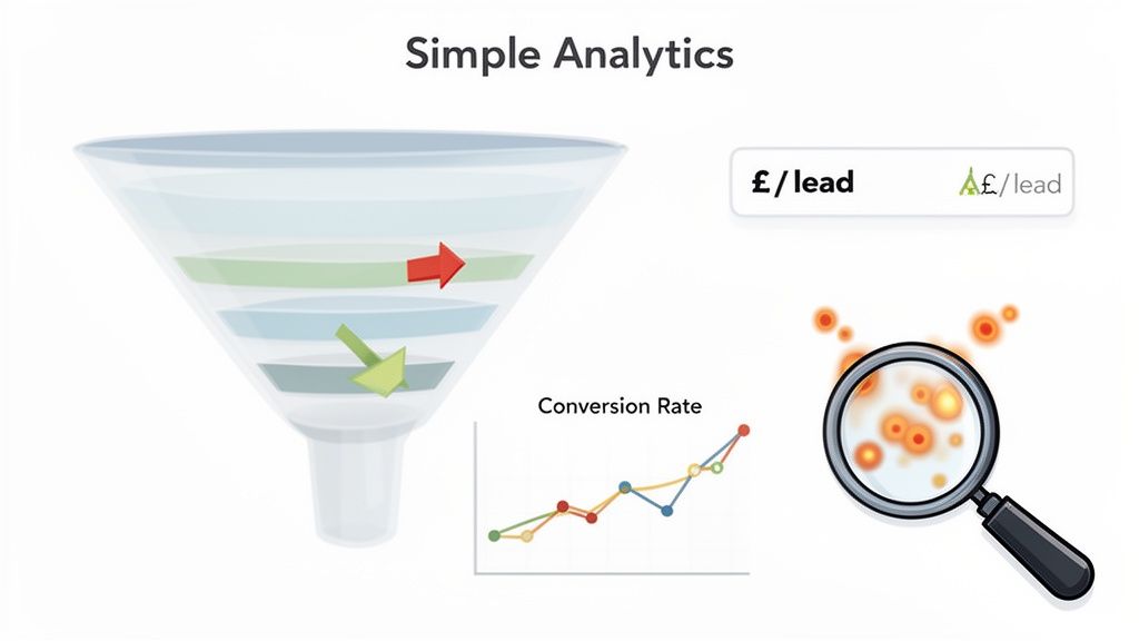
Uncovering Insights With Conversion Rate Optimisation Tools
While analytics tells you what is happening on your site, Conversion Rate Optimisation (CRO) tools help you understand why. They provide qualitative insights into user behaviour, helping you pinpoint the exact points of friction that stop visitors from converting.
Three types of tools are particularly effective for this:
- Heatmaps: These tools create visual maps of where users click, move their mouse, and how far they scroll. They are invaluable for seeing which parts of your page attract attention and which are ignored.
- Session Recordings: These are anonymised videos of real user sessions. Watching these can be an eye-opening experience, revealing confusing navigation, broken elements, or frustrating forms you would never have spotted yourself.
- A/B Testing Platforms: These let you test variations of a page element—a different headline, a new button colour, a shorter form—to see which performs better, removing guesswork from the equation.
A data-led approach to optimisation is non-negotiable. Stop making subjective guesses about what your customers want and start using real user behaviour to guide your design and copy decisions. This is how you build a website that improves over time.
This proactive approach to improvement is what sets top-performing businesses apart. In the UK, companies using tools like anonymous visitor tracking on their websites see 23% more prospect conversions compared to businesses relying on standard forms alone. This is because a staggering 97% of website visitors leave without ever identifying themselves, representing a huge pool of missed opportunities. You can find more details on this and other key lead generation statistics from SendIQ.
Creating A Culture Of Iteration
Ultimately, the most successful lead generation websites belong to businesses that embrace a culture of continuous iteration. The market changes, customer expectations evolve, and your competitors are always seeking an edge. Your website must adapt.
This means committing to a regular cycle of:
- Measure: Keep a close eye on your core KPIs.
- Analyse: Use CRO tools to understand user behaviour and form a hypothesis.
- Test: Run structured A/B tests to validate your hypothesis.
- Implement: Roll out the winning changes and begin the cycle again.
By treating your website as an ongoing project rather than a one-off build, you create a powerful engine for sustainable growth. Each small improvement adds up, steadily lowering your cost per lead and increasing the value of your most important digital asset.
We have covered a lot of ground. You now have the blueprint for turning your website from a simple online brochure into a machine that consistently brings in new business. But a plan is just a plan until it is acted upon.
Let’s be clear: building a website that generates leads is not just a creative exercise. It is a fundamental commercial activity, driven by solid strategy, real data, and an obsessive focus on your customer.
The first thing you should do is take a hard, honest look at your current website. Review your analytics. Where are people leaving? Are your contact forms difficult to complete? A proper, unsentimental audit will reveal exactly where the biggest opportunities are.
From Plan to Profit
Once you have a clear picture of your current position, it’s time to focus on high-impact actions. These are the practical steps that will take you from planning to seeing a real return on your investment.
- Define Your Ideal Customer Profile: Who are you selling to? Does the language on your site speak directly to their biggest commercial challenges and frustrations? If not, it needs to.
- Map Your Key Conversion Paths: For your most important service, trace the exact journey a visitor must take to become a lead. Identify every point of friction—every confusing button, every unnecessary step—and eliminate it.
- Outline Your Initial Content: What are the top three questions your ideal customers are typing into Google? Plan the blog posts or guides that will answer those questions and start attracting the right kind of search traffic.
The aim is to build momentum. Taking these deliberate first steps provides the clarity and control you need to make your website a predictable, profitable source of qualified leads.
Common Questions Answered
When it comes to planning a new website, UK business owners tend to have the same questions. Let’s address the main ones directly.
How Much Should I Budget for a Lead Generation Website?
This is a common question, and the answer varies. However, it is essential to stop thinking of it as a cost and start seeing it as an investment.
A cheap website that generates no business is the most expensive option in the long run. For a professionally designed, conversion-focused site built in the UK, you should expect a starting budget of around £2,000 to £5,000. This figure will increase with complexity and custom features.
The key takeaway is that you are not just buying a website; you are investing in an asset that should generate revenue for your business.
How Long Does It Take to Build a Website?
For a properly planned lead generation website, a realistic timeline is between 6 and 12 weeks.
This period covers everything from initial strategy and wireframing through to design, development, content creation, and thorough testing. Rushing this process almost always means cutting corners on crucial elements like strategy or user experience—the very things that determine whether your site converts visitors into leads. A structured approach with clear milestones is the only way to guarantee a quality result that helps you achieve your commercial targets.
Should I Use a Template or a Custom Design?
Templates can seem like a cost-effective way to get started, and in some cases, they are. However, a custom design built specifically around your ideal customer’s journey and your unique business goals will almost always deliver better results.
A custom solution is engineered from the ground up to remove friction for your target audience. It guides them smoothly from A to B and is designed to integrate directly with your sales and marketing systems. While the choice depends on your budget, if you are serious about lead generation, a custom approach almost always provides a superior return on investment.
Ready to turn your website into your most effective sales tool? Lead Genera builds high-performance websites engineered for one purpose: to deliver a predictable stream of qualified leads. Book your free strategy call today.
Categories
Do You Need Assistance With
Sign Up To Our Newsletter